Kerry Rodden
Data analysis and visualization
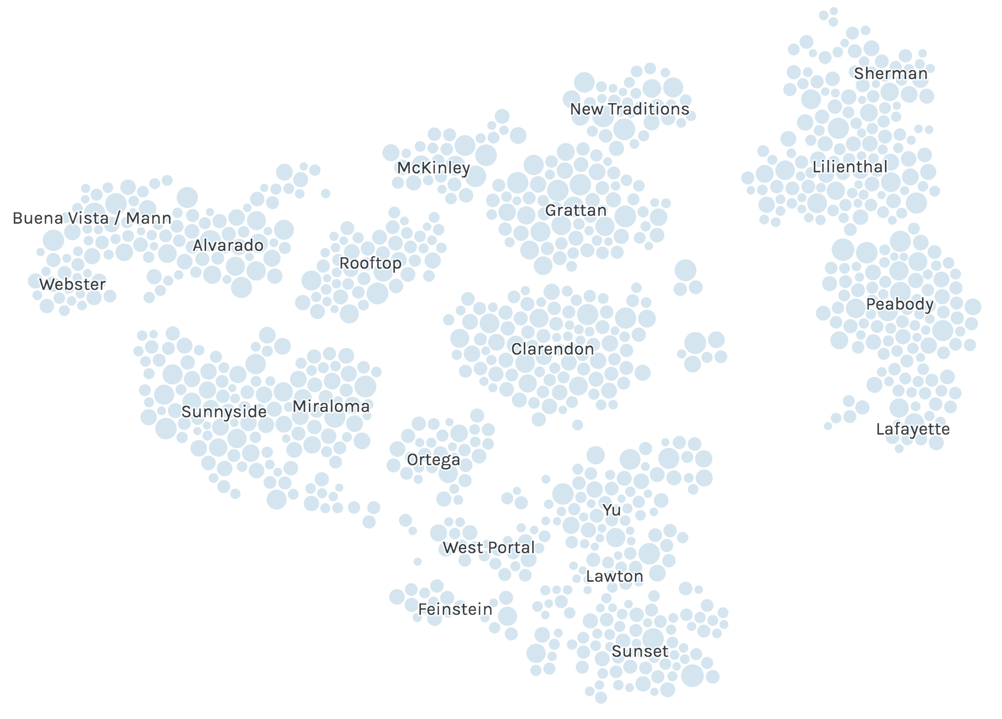
SF kindergarten applications
Scrolling story that becomes interactively searchable at the end.

Ranked-choice voting
Visualizing the results of the 2018 election for mayor of San Francisco.
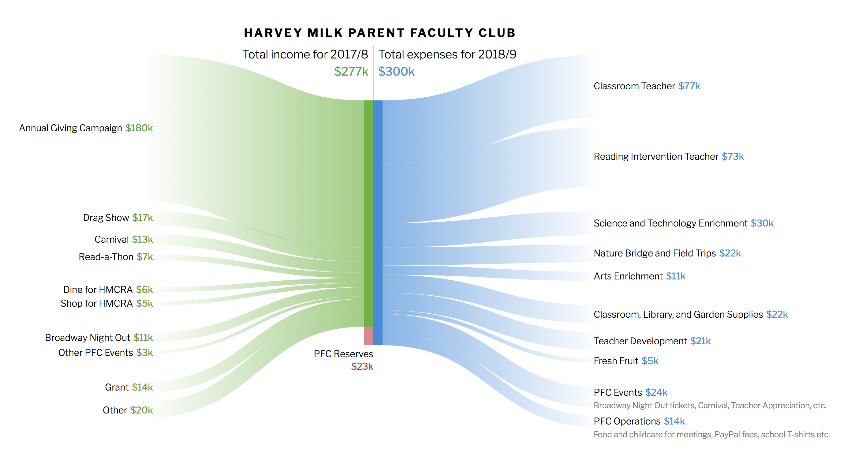
Budget flow
Visualizing a budget in terms of the flow of inputs and outputs.
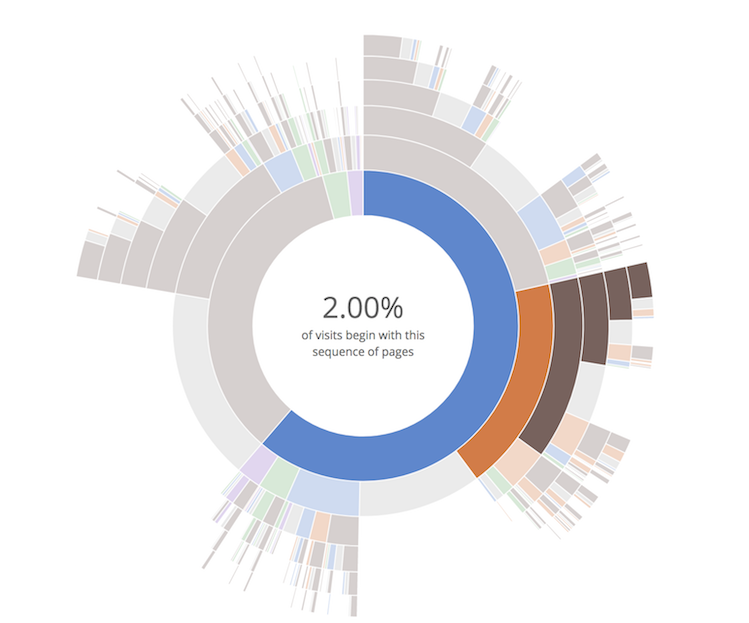
Sequences sunburst
Aggregate visualization of many sequences, like paths through a web site.
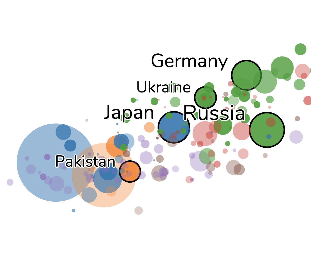
Dynamic labels
Automatic labeling of the circles in a motion chart according to their movement.
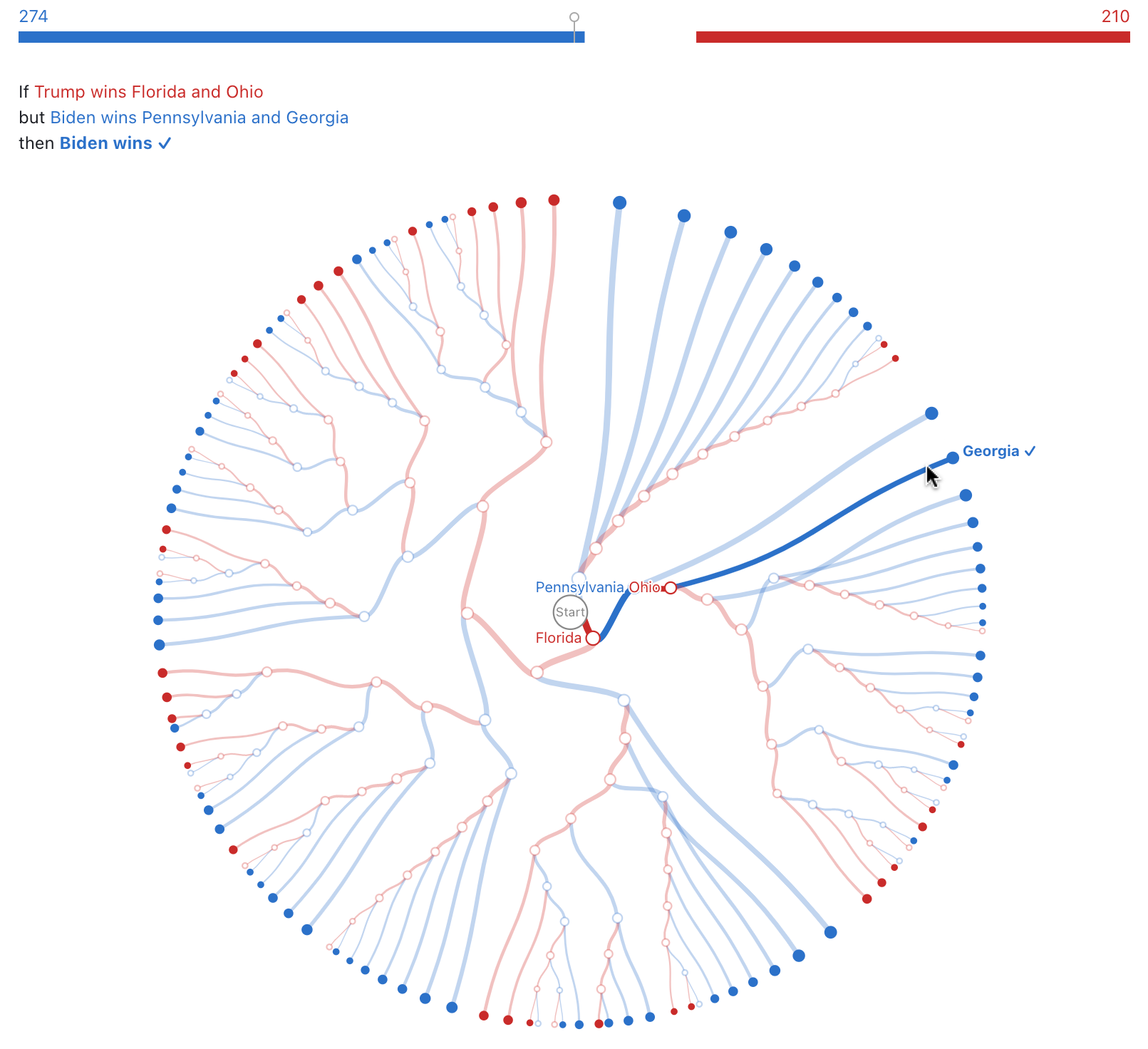
Electoral College decision tree
Offers interactive exploration of possible election outcomes.
You may also be interested in my academic publications or the HEART framework for UX metrics.